This is the low nose version of the car, and you can see how the nose itself is slightly raised from the front wing as mentioned in my previous posts. The front wing as added detail on the vanes with a joining support wire. This model has 3D bodylines, as my cars also do. You can see that there is more detail on the suspension and the wheel hub. The smaller bargeboard hidden in the suspension is beautifully done, as it's not quite straight, but looks almost warped, a nice touch.
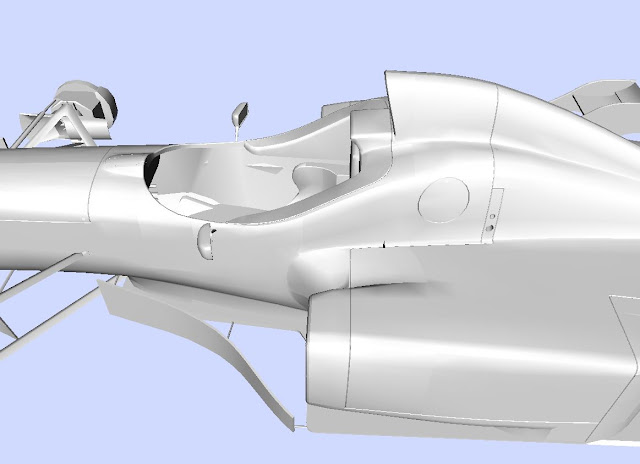
The nice work on the bodylines can be see in this shot above. The integration of the rear of the side head rest protection is nicely done, with the front part being quite flat, whilst it is much more curved by the fuel cap and rearwards from there. The head protection itself is wonderfully detailed. The seat is nicely recreated, though there's not too much else in the cockpit worth mentioning.
The rear of the car has some lovely details and I wanted to show the wireframe so that you can see some of the details and modelling techniques used to create them. One of the things I try and do is to make sure all my polygons face the same way, |\|\|\|\|, where as there's some difference on this car around the rollover bar.
There's some nice detail on the hump at the rear of the engine cover, and the suspension pickup points. The rear fin has some nice detail as does the rear wing itself.
When I said the GP4 car took a few liberties in the diffuser region, it was to this car I was comparing it to, which from what i can tell from pictures is much more accurate and well proportioned. You can see some of the complexities of the rear suspension from this angle and how tightly packaged it all is, something you don't necessarily appreciate unless you try and make it yourself.
Finally here's a nice shot of the car where you can see the detail on the seat, the hump in front of the cockpit with bodylines on it, must have taken a while to get that right. The conversion to 3DS format has knocked the normals a bit, so the sidepods don't look as smooth as it does in game.
I think it looks great in game. If this car was to make it into a newer game, I'd expect to see more polygons and more details than before, particularly on the insides and the cockpit which are lacking a little in detail in F1 2013. I hope you enjoyed this slight detour from my regular postings, but I always try and follow modern techniques to further improve myself and my modelling.


No comments:
Post a Comment